MintPalDecor has built a reputation for clean, approachable interiors that balance current trends with lasting appeal. Their signature style, soft neutrals anchored by fresh mint accents, delivers spaces that feel both modern and livable. Whether you’re refreshing a single room or planning a whole-home update, these design strategies translate to real-world projects. This guide breaks down the core principles behind MintPalDecor’s aesthetic, from selecting a cohesive color palette to layering textures that add dimension without clutter. No fluff, just practical advice you can apply this weekend.
Key Takeaways
- MintPalDecor’s design philosophy prioritizes restraint with personality by using a limited color palette of three to five shades paired with natural materials like wood, linen, and stone that give each element room to breathe.
- A cohesive home color strategy follows the 60-30-10 rule: 60% base neutral, 30% secondary neutral for depth, and 10% accent colors like mint for throw pillows, artwork, or seasonal decor swaps.
- Mint accents work best as mid-tone accents paired with warm whites and natural wood tones—avoid pairing with cool grays, and start with removable elements like throws or rugs if you’re unsure about commitment.
- Floating furniture and creating defined zones with area rugs makes rooms feel larger, while mixing furniture heights and varying textures (rough, soft, and smooth finishes) prevents spaces from feeling flat or boring.
- Paint is the highest ROI update for interior design, with quality paint costing $40–$70 per gallon and covering 350–400 square feet, while swapping hardware, lighting fixtures, and DIY artwork deliver dramatic impact for under $300.
- Ruthless editing and intentional layering of patterns at varying scales transforms a space more effectively than buying additional items, making strategic rearrangement and seasonal textile swaps budget-friendly refresh options.
Understanding the MintPalDecor Design Philosophy
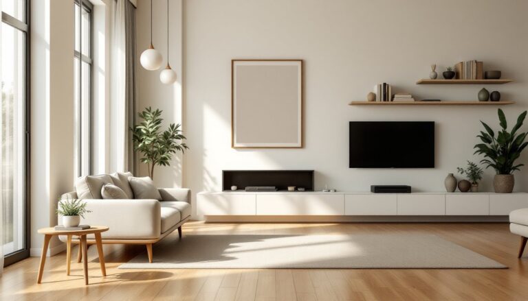
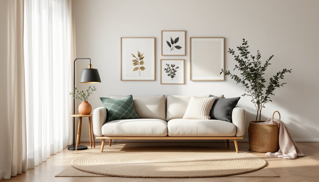
MintPalDecor’s approach centers on restraint with personality. The framework relies on a limited color palette, typically three to five shades, paired with natural materials like wood, linen, and stone. This isn’t minimalism for the sake of empty walls: it’s about giving each element room to breathe.
The philosophy emphasizes functional beauty. Every piece should serve a purpose, whether it’s storage, seating, or visual interest. Decorative objects aren’t banned, but they’re edited down to items that genuinely resonate with the homeowner. Think one sculptural vase rather than a dozen small tchotchkes.
Proportional balance matters here. MintPalDecor interiors often use asymmetrical balance to create visual interest, a tall floor lamp on one side of a sofa, balanced by a low side table and art on the other. This technique keeps spaces from feeling too rigid or staged.
Materials lean toward the tactile and honest: unsealed oak, matte paint finishes, woven baskets, ceramics with visible imperfections. Avoid high-gloss anything unless you’re highlighting a single statement piece. The goal is warmth, not showroom shine.
Color Palette Strategies for a Cohesive Home
A cohesive home doesn’t mean every room is the same color, it means your palette flows logically from space to space. Start with a base neutral (white, greige, warm gray, or soft beige) that appears in at least 60% of your surfaces: walls, large furniture, flooring.
Next, pick a secondary neutral for depth. If your base is a cool gray, add warmth with taupe upholstery or oak trim. If you start with beige, layer in charcoal or graphite accents. This 30% layer includes area rugs, curtains, and secondary seating.
The final 10% is your accent layer. This is where mint, blush, terracotta, or navy come in. Use it sparingly: throw pillows, a single armchair, artwork, or small decor items. Swap these seasonally if you get bored.
Test paint samples in the actual room before committing. Paint a 2’×2′ square on at least two walls, one that gets morning light, one that doesn’t. Live with it for three days. Natural light shifts undertones dramatically, and what looks fresh at noon can turn sickly green at dusk.
Incorporating Mint and Neutral Tones Effectively
Mint works best as a mid-tone accent, not a wall color in every room. For a subtle approach, use mint on trim, cabinetry, or a single accent wall. Pair it with warm whites (not stark white, which can read clinical) and natural wood tones. Oak, walnut, and rattan all complement mint without competing.
Avoid pairing mint with cool grays, it often skews too icy. Instead, ground it with warmer neutrals like sand, oatmeal, or soft taupe. These take the edge off mint’s coolness and make spaces feel inhabited, not staged.
For textiles, mint works well in pattern-based fabrics where it’s one of several colors. A geometric throw pillow with mint, charcoal, and cream feels intentional. An all-mint sofa can feel like a bold commitment you’ll regret in two years.
If you’re nervous about commitment, start with removable elements: a mint throw blanket, dish towels, or a small accent rug. You can test the vibe before investing in upholstery or paint. In kitchens, mint tile backsplashes offer a fresh, timeless look when paired with white cabinetry and brass hardware.
Furniture Selection and Arrangement Tips
Before you buy a single piece, measure your room and draw a scaled floor plan. Use graph paper (¼” = 1′) or a free tool like RoomSketcher. Note door swings, windows, outlets, and radiators. Furniture that looks perfect online often won’t fit your actual layout.
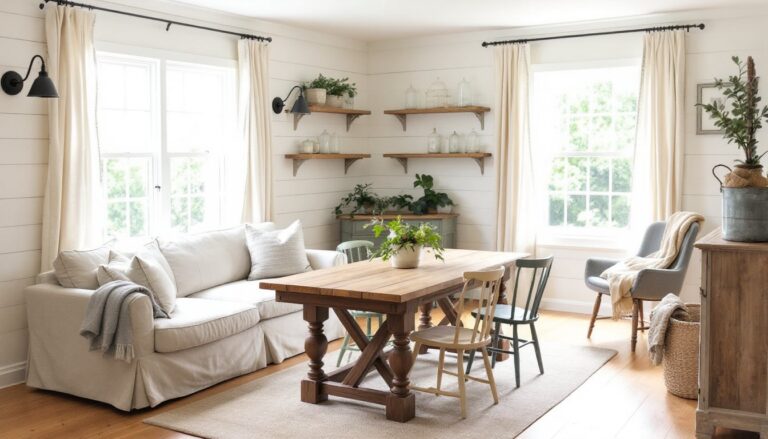
Start with anchor pieces: sofa, bed, dining table. These should be neutral in color and classic in silhouette. A good-quality sofa in a durable fabric (performance linen, tight-weave cotton, or leather) will outlast three trendy accent chairs. Look for hardwood frames (not particleboard) and eight-way hand-tied springs if budget allows.
Avoid pushing all furniture against the walls. In living rooms, float the sofa a few feet off the wall and anchor it with an area rug. This creates a defined conversation zone and makes the room feel larger, not smaller. Leave at least 18–24 inches of walking space around furniture.
For dining areas, allow 36 inches between the table edge and the wall or nearest obstacle. This gives diners room to push their chairs back without hitting anything. If space is tight, consider a round table, it’s easier to navigate and seats more people per square foot than a rectangular one.
Mix furniture heights to create visual rhythm. A low-slung sofa pairs well with a tall bookcase or floor lamp. All medium-height pieces (around 30–36 inches) create a flat, boring sightline. Understanding proportion in your layout prevents spaces from feeling top-heavy or awkward.
Layering Textures and Patterns for Depth
A room with perfect color can still fall flat if every surface is smooth and matte. Texture adds dimension that paint alone can’t deliver. Combine at least three tactile finishes per room: rough (jute rug, raw wood), soft (linen curtains, wool throw), and smooth (ceramic vase, metal hardware).
Start with the largest surfaces. Swap a flat-weave rug for a chunky braided jute or a high-pile wool. Replace basic roller shades with linen Roman shades or textured curtains. These changes register immediately and don’t require a permit or power tools.
For upholstery, vary the weave. If your sofa is a tight linen, add a chunky knit throw and a few velvet or cotton pillows. Avoid matching pillow sets, they look catalog-stiff. Mix solid textures with one or two patterned pieces.
Pattern mixing follows a simple rule: vary the scale. Pair a large-scale floral or geometric print with a small-scale stripe or dot. Keep the color palette consistent (your base, secondary, and accent colors) so patterns feel related, not random. Stick to two to three patterns max in a single sightline.
Don’t forget architectural texture. Shiplap, board-and-batten, or even a textured wallpaper on one accent wall adds interest without requiring constant styling. Layering patterns thoughtfully prevents a space from feeling one-dimensional while maintaining the clean lines MintPalDecor is known for.
Budget-Friendly Décor Updates That Make an Impact
You don’t need a five-figure budget to shift the feel of a room. Paint is the highest ROI update you can make. A gallon of quality paint (Sherwin-Williams, Benjamin Moore) runs $40–$70 and covers roughly 350–400 square feet with one coat. Prep matters: clean walls, patch holes with spackle, sand smooth, and prime stains or dark colors before applying your topcoat.
Swap out hardware. Replacing builder-grade drawer pulls and cabinet knobs with matte black, brushed brass, or ceramic options costs $3–$8 per piece. Budget $150–$300 for a full kitchen refresh. It’s a one-hour project with just a screwdriver.
Upgrade lighting fixtures. A new pendant or flush-mount ceiling fixture changes a room’s character instantly. Look for options in the $80–$200 range. If you’re not comfortable with electrical work, hire a licensed electrician, most will swap a fixture for $75–$150, and it’s safer than guessing at wire connections.
DIY artwork saves hundreds. Frame fabric remnants, vintage maps, or botanical prints. IKEA and Target sell frames for $15–$40. Create a gallery wall using a paper template taped to the wall first, this lets you adjust spacing before hammering nails.
Rearrange what you have. Move a bookshelf from the living room to the bedroom. Swap lamps between rooms. Editing down surfaces (remove half the decor items on your shelves) often makes a bigger impact than buying more stuff. Interior design doesn’t always require major budget outlays, sometimes it’s about editing with intention.
For seasonal refreshes, focus on textiles: swap throw pillows, blankets, and table linens. Stores like H&M Home, West Elm’s sale section, and Homedit’s curated lists offer accessible options in current colorways. Budget $100–$200 twice a year for a noticeable shift without long-term commitment.
Conclusion
MintPalDecor’s design principles aren’t about chasing trends, they’re about building a foundation that adapts as your tastes evolve. Stick to a disciplined color palette, invest in quality anchor pieces, and layer textures with intention. Most importantly, edit ruthlessly. A well-proportioned room with carefully chosen elements always beats a cluttered space filled with “good enough” items. Start with one room, apply these strategies, and adjust as you go.