Color is the fastest, most affordable tool in your DIY arsenal, and the easiest to mess up. One wrong shade can make a room feel cramped, cold, or just off. But get it right, and you’ll transform a space without touching a single stud or joist. This guide walks through the science and strategy behind choosing and applying interior color, from understanding how hues affect mood to picking the right palette for every room in your home. No fluff, no inspiration boards, just practical advice you can act on this weekend.
Key Takeaways
- Color psychology shapes how rooms feel: warm colors energize social spaces like kitchens and dining rooms, while cool colors promote calm and focus in bedrooms and bathrooms.
- Use the color wheel to build balanced interior design palettes through complementary, analogous, triadic, or monochromatic schemes, avoiding guesswork that leads to costly repaints.
- Apply the 60-30-10 color rule to proportion your room: 60% dominant color (walls), 30% secondary (upholstery), and 10% accent (accessories).
- Test paint samples on actual walls for at least 24 hours across different lighting conditions before committing, as colors shift dramatically under natural versus artificial light.
- Proper prep work and technique—priming before painting, using two coats minimum, and cutting in before rolling—prevent uneven coverage and the need for do-overs.
- Extend your color scheme beyond walls with textiles, wallpaper, and artwork, allowing flexibility to test bold colors before permanent interior design changes.
Understanding Color Psychology in Interior Design
Color isn’t just aesthetic, it’s physiological. Different wavelengths hit your retina and trigger measurable responses: heart rate shifts, cortisol changes, even digestion. That’s why hospitals use soft greens and blues, and fast-food chains lean into reds and yellows.
Warm colors (reds, oranges, yellows) are stimulating. They raise energy, encourage conversation, and make spaces feel cozier, but also smaller. Use them in social zones like kitchens, dining rooms, or home gyms. Deep reds can increase appetite, which is why they’re common in dining spaces. Be cautious in bedrooms: too much warmth can interfere with sleep.
Cool colors (blues, greens, purples) are calming and recessive. They lower blood pressure, promote focus, and make rooms feel more spacious. Blues work well in bedrooms and bathrooms. Greens, being the most common color in nature, are versatile and restful, fitting nearly anywhere. Just avoid cool tones in north-facing rooms with little natural light: they can read as gray or drab.
Neutrals (whites, grays, beiges, taupes) offer flexibility and longevity. They’re the backbone of most color schemes, letting you swap accent colors without repainting entire rooms. Warm neutrals (beige, greige) feel inviting: cool neutrals (gray, white) feel modern and crisp. Test samples in your actual lighting before committing, what looks like a soft gray at the store can turn blue or purple under LED bulbs.
One often-overlooked factor: sheen. Flat and matte finishes absorb light and soften color intensity. Satin and eggshell reflect more light, making colors appear slightly brighter. Semi-gloss and gloss amplify color saturation and are easier to clean, ideal for trim, doors, and high-traffic areas. Always factor in sheen when comparing paint chips.
The Color Wheel and How to Use It Effectively
The color wheel isn’t art-class nostalgia, it’s a practical tool for building palettes that actually work. Most DIY mistakes come from guessing instead of using basic color relationships.
Primary colors (red, blue, yellow) can’t be mixed from other colors. Secondary colors (green, orange, purple) are made by mixing two primaries. Tertiary colors (red-orange, yellow-green, blue-purple) are primaries mixed with secondaries. That gives you twelve stops on the wheel.
Here’s how to use it:
Complementary colors sit opposite each other, blue and orange, red and green, yellow and purple. They create high contrast and energy, great for accent walls or bold statements. Use one as the dominant color (60-70% of the room) and the other sparingly (10-15%) in accessories or trim. Full-strength complements can be jarring: try tinting one (adding white) or shading it (adding black) for balance.
Analogous colors are neighbors on the wheel, blue, blue-green, and green, for example. They’re harmonious and easy on the eye, ideal for creating flow between rooms or a cohesive, low-contrast look. Choose one dominant hue and use the others as accents. This is a safe bet for open floor plans.
Triadic colors are evenly spaced around the wheel (red, yellow, blue). They’re vibrant and balanced but harder to pull off. Use one as your base and the other two in smaller doses, think pillows, art, or a single accent chair.
Monochromatic schemes use one color in varying tints, tones, and shades. It’s foolproof and sophisticated, but can feel flat without texture. Layer in different materials, linen, wood, metal, and vary your sheens to add depth. This works beautifully in bedrooms and bathrooms where you want a calm, unified feel.
Designers often reference the 60-30-10 color rule to proportion colors within a room: 60% dominant (walls, large furniture), 30% secondary (upholstery, rugs), and 10% accent (pillows, art, accessories).
Choosing the Right Color Scheme for Each Room
Not every color works in every room. Function, light, and traffic all matter. Here’s how to match palette to purpose.
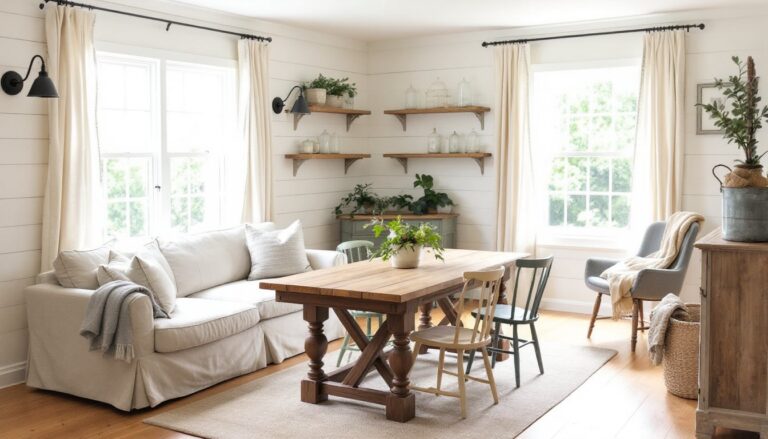
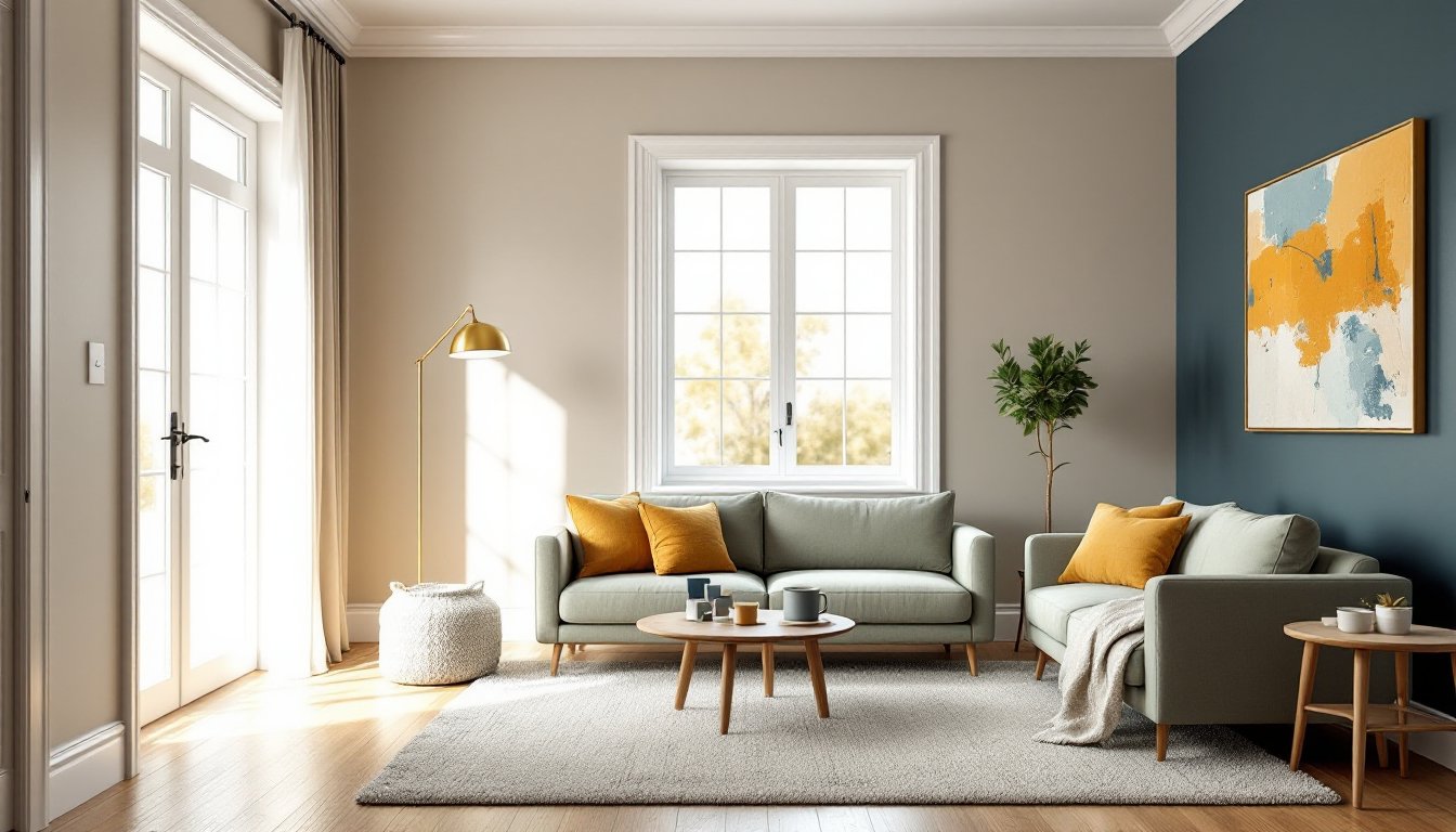
Living Rooms and Common Areas
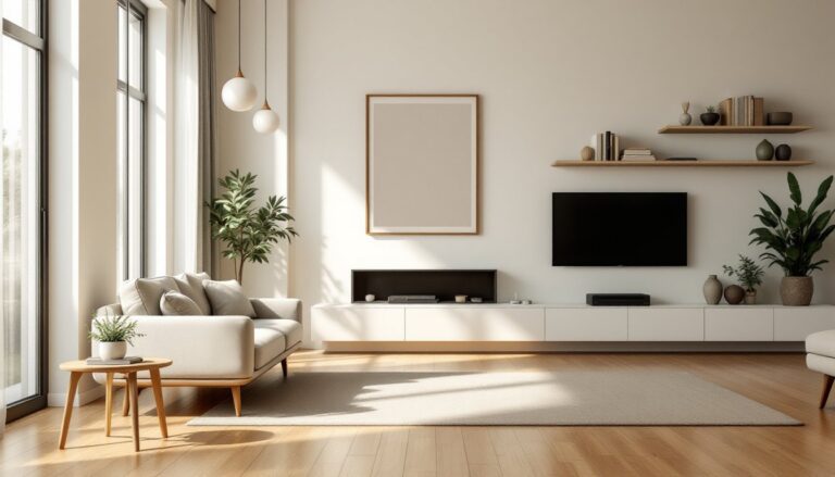
Living rooms handle the most varied activities, conversation, TV, reading, napping, so your palette needs to be balanced and flexible. Neutrals are the safest base, but don’t default to builder beige out of fear.
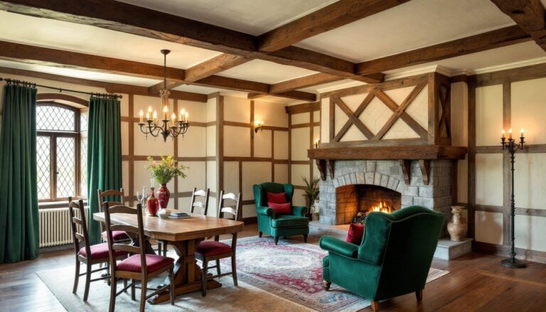
Light neutrals (soft whites, pale grays, warm greiges) make small or dim rooms feel larger and brighter. They’re forgiving with furniture styles and easy to accessorize. Pair them with mid-tone accents in blues, greens, or warm terracotta for personality without commitment. If your space has good natural light, you can go darker, charcoal, navy, or even black, on a single accent wall. Dark colors absorb light and create drama, but they require adequate lighting (both natural and artificial) to avoid feeling like a cave.
Open-concept spaces benefit from asymmetrical balance in color: use one dominant hue across the main living zone, then shift slightly in adjacent areas (kitchen, dining) with analogous tones. This maintains flow without monotony.
Avoid overly cool palettes in north-facing living rooms, they’ll feel sterile. Add warm wood tones, brass fixtures, or caramel leather to offset cool grays and blues. If you’re working with existing furniture or flooring, pull your palette from the undertones already in the room. Most woods have warm (yellow, orange, red) undertones: gray couches often have cool (blue, purple) undertones. Clashing undertones is a more common mistake than clashing colors.
Common areas also benefit from durable finishes. Use satin or eggshell on walls for easier cleaning, and semi-gloss on trim and doors to resist scuffs.
Bedrooms and Private Retreats
Bedrooms should promote rest, which usually means lower contrast and cooler or muted tones. But “calming” doesn’t mean boring.
Blues and greens are proven sleep-friendly colors. Soft sage, powder blue, and misty gray-blue lower heart rate and promote relaxation. Deeper tones like navy or forest green work well in larger bedrooms with ample light, especially when paired with crisp white trim and warm wood furniture. These deeper shades can feel cocooning rather than oppressive if you balance them with lighter bedding and window treatments.
Warm neutrals, blush, taupe, warm gray, also work if you prefer a softer, more intimate feel. Avoid bright whites in bedrooms: they can feel stark and clinical. Off-whites or creams with warm undertones are more restful.
Reds and bright oranges should generally stay out of bedrooms. They’re too stimulating for sleep, though muted versions (terracotta, rust, dusty rose) can work as accents in moderation.
Consider proportion when selecting furniture and integrating it with your color scheme, oversized dark furniture in a small, darkly painted room compounds the problem.
For kids’ rooms, resist the urge to go full primary-color explosion. Bright colors are fine in play areas, but bedrooms benefit from more muted versions. A soft mint or periwinkle with pops of brighter accent colors (via bedding, art, bins) is more versatile as they age and easier to transition.
Finish matters in bedrooms: Use flat or matte paint to minimize light reflection and imperfections. It’s harder to clean, but bedrooms see less wear than living spaces.
Practical Tips for Applying Color in Your Home
Choosing color is half the battle. Applying it correctly is where most DIYers stumble. Here’s how to get it right.
Start with samples, real ones. Paint at least a 2′ x 2′ square on the actual wall, not just a brush stroke. Paint looks different on drywall than on cardboard. Do this on multiple walls if your room gets varied light. Let it dry completely (24 hours minimum) and check it at different times of day. Morning light skews cool and blue: afternoon light is warmer: evening artificial light changes everything.
Prep work is non-negotiable. Clean walls with TSP or a deglossing cleaner to remove grease and grime. Fill holes and cracks with spackle, let dry, then sand smooth. Prime any repairs, stains, or dark colors you’re covering, especially reds, deep blues, and dark browns. Skipping primer means more coats later and uneven coverage. Use a stain-blocking primer (like Zinsser BIN or Kilz) over water stains, smoke damage, or raw wood to prevent bleed-through.
Two coats minimum. One coat rarely covers evenly, even with “paint and primer in one” products. Budget your time and material accordingly. Most interior paints cover 350-400 square feet per gallon per coat. Measure your walls (length × height, minus windows and doors) to estimate how much you need. Buy an extra quart for touch-ups.
Cut in before rolling. Use a 2.5″ angled brush to paint edges, corners, and trim lines first. Then roll the main wall area with a 3/8″ nap roller for smooth surfaces or a 1/2″ nap for textured walls. Roll in a “W” pattern to distribute paint evenly, then fill in without lifting the roller. Work in 3′ x 3′ sections, keeping a wet edge to avoid lap marks.
Use painter’s tape correctly, or skip it. If you use tape, press the edges down firmly with a putty knife to prevent bleed. Remove it while the paint is still slightly wet (not bone dry) at a 45-degree angle. Many pros skip tape entirely and rely on a steady hand and good brush technique. If you’re nervous, practice cutting in on a closet wall first.
Add color with more than just paint. If you’re not ready to commit to bold walls, bring in color via removable wallpaper, which has come a long way and now installs and removes cleanly with no primer or paste. Patterns can energize a space without the permanence of paint.
Textiles, curtains, rugs, throw pillows, are the fastest way to test new colors. Swap them seasonally or as trends shift. Artwork and accessories offer the same flexibility. For design inspiration, browse home interiors to see how color combinations work in real spaces.
Don’t forget the ceiling and trim. Ceilings don’t have to be flat white. Painting them the same color as the walls (or a lighter tint) can make a room feel larger and more cohesive. Darker ceilings add drama but require high ceilings and good lighting to work. Trim in semi-gloss white is classic and makes colors pop, but colored trim is making a comeback, try matching it to your wall color for a modern, seamless look.
Plan for touch-ups. Label and date your leftover paint cans, or write the formula and brand on the inside of a light switch plate. Paint fades and formulas change: having a reference makes future touch-ups or reorders easier. Store leftover paint in a cool, dry place (not a freezing garage) and it’ll last 2-3 years.
If you’re managing a larger project across multiple rooms, keep track of overall design costs to avoid budget creep. Paint is affordable, but trim, supplies, and tools add up fast.
Conclusion
Color is the easiest and most impactful change you can make in a home, but it’s not a guessing game. Understand how hues affect mood, use the color wheel to build balanced schemes, match palettes to room function, and don’t skip the prep. Whether you’re painting a single accent wall or coordinating an entire floor plan, these fundamentals will help you avoid costly repaints and create spaces that actually feel right.