Walk into most builder-grade homes and you’ll notice something missing, not furniture or paint color, but feel. The walls are flat, the fabrics generic, the surfaces predictable. That’s where tactile texture comes in. It’s the difference between a room that looks fine in photos and one that makes you want to kick off your shoes and settle in. Tactile texture isn’t decorative flourish: it’s a foundational element that adds physical depth, visual interest, and genuine warmth. Whether you’re refinishing a tired living room or spec’ing materials for a ground-up remodel, understanding how to layer textures will elevate every space you touch.
Key Takeaways
- Tactile texture in interior design creates physical depth and warmth that elevates a space beyond flat paint and generic materials, making rooms feel inviting rather than sterile.
- Contrast is essential—pairing smooth surfaces with rough ones (like marble countertops against brick) gives the eye visual interest and prevents monotony without relying on bold colors alone.
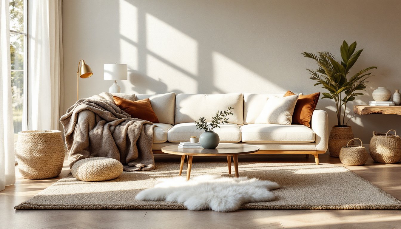
- Fabric choices like linen, velvet, wool, and bouclé are the easiest entry point for adding tactile texture, and layering them in varied scales and weights creates sophisticated dimension.
- Balance is critical when incorporating tactile texture; too much creates visual chaos, so let one or two dominant textures carry the design and use others as accents.
- High-traffic areas require durable, easy-to-clean textures like leather and tight-weave synthetics, while matte finishes hide imperfections better than glossy ones in practical everyday spaces.
- Test texture samples in your actual lighting conditions before committing, as natural light, incandescent, and LED bulbs all shift how tactile texture reads in a finished room.
What Is Tactile Texture and Why Does It Matter?
Tactile texture refers to the physical surface quality of materials, how they actually feel when touched. It’s distinct from visual texture, which creates the illusion of surface variation through pattern or color. Think linen upholstery versus a printed linen-look polyester. One invites your hand: the other just looks the part.
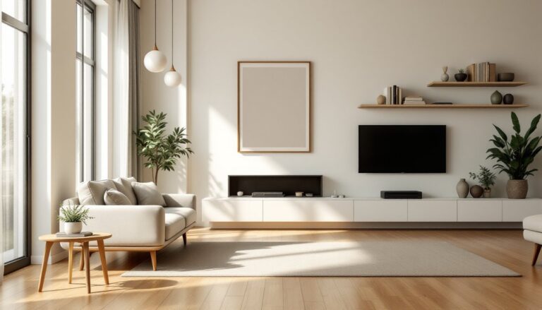
In interior design, tactile texture matters because humans are hardwired to respond to touch. A room filled with smooth drywall, flat paint, and synthetic fabrics reads as sterile, even if the color palette is on point. Add a chunky wool throw, reclaimed wood shelving, or a plaster accent wall, and the space gains dimension that photographs can’t fully capture.
From a practical standpoint, texture also affects acoustics, light reflection, and durability. Rough-sawn lumber absorbs sound differently than polished concrete. Matte finishes hide wall imperfections better than high-gloss. When selecting materials, designers and DIYers should consider not just aesthetics but how texture performs in real-world conditions, high-traffic areas, humidity, and daily wear.
How Tactile Texture Transforms the Feel of a Space
Texture does three things that color and layout alone can’t: it creates contrast, adds warmth, and grounds a design scheme.
Contrast is where texture earns its keep. Pairing smooth surfaces with rough ones, polished marble countertops against a brick backsplash, or velvet cushions on a rattan chair, gives the eye something to latch onto. Without contrast, even a well-proportioned room can feel flat. This principle applies to asymmetrical balance, where varied textures help distribute visual weight across a space without rigid symmetry.
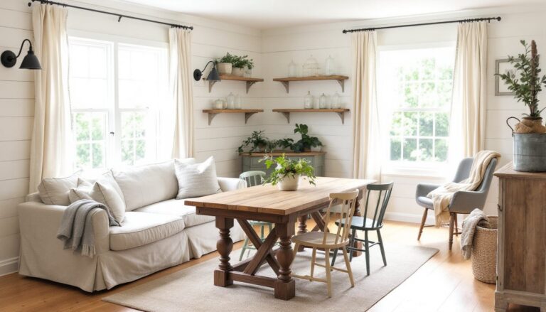
Warmth comes from materials that feel organic or handmade. Natural wood grain, stone with visible veining, linen with a slight slub, these textures communicate age, craft, and livability. They soften the clinical edge of modern minimalism. This is especially critical in open-plan homes where hard surfaces dominate (tile, concrete, steel). Layering in softer, irregular textures prevents the space from feeling like a showroom.
Grounding happens when texture anchors a design concept. If you’re working with a neutral palette, texture becomes the primary tool for differentiation. A monochrome living room gains complexity through varied pile heights in rugs, different weaves in upholstery, and mixed finishes on wood furniture. According to Architectural Digest, this layered approach is increasingly favored over bold color in contemporary interiors.
One thing to note: too much texture can overwhelm. A room with shag rugs, heavily carved furniture, and multiple bold patterns in the design risks visual chaos. Balance is key, let one or two textures dominate and use others as accents.
Best Materials and Surfaces for Adding Tactile Interest
Choosing the right materials starts with understanding where texture makes the most impact. Some surfaces beg to be touched: others contribute atmosphere through visual roughness or softness.
Fabrics and Soft Furnishings
Upholstery fabrics are the easiest entry point for tactile texture. Consider these workhorses:
- Linen: Breathable, slightly irregular weave. Softens with age but wrinkles easily. Best for low-traffic seating or pillow covers.
- Velvet: Dense pile that shifts in light. Durable when backed with quality construction. Watch for crush marks in high-use areas.
- Bouclé: Looped, nubby surface. Trending hard in modern interiors. Can snag, so avoid in homes with pets that climb furniture.
- Wool: Naturally stain-resistant and resilient. Use in rugs, throws, or upholstery. Heavier weaves (like tweed or boucle blends) add substantial texture.
Throws and pillows are low-commitment ways to test texture. A chunky knit throw over a leather sofa or a silk pillow against linen upholstery creates instant contrast. Rotate seasonally, heavyweight wool in winter, lightweight cotton or linen in summer.
Area rugs anchor a room and provide underfoot texture. Options include:
- Jute or sisal: Rough, durable, affordable. Good for layering under softer rugs but scratchy for bare feet.
- Wool or wool-blend: Soft, resilient, naturally flame-retardant. Look for hand-tufted or hand-knotted for depth.
- Sheepskin or cowhide: Bold statement pieces. Work best as accent rugs over hardwood or as throws.
When mixing soft furnishings, vary the scale. Pair a large-weave throw with a fine linen pillow, or a flat-weave rug with a high-pile accent.
Wall Treatments and Architectural Elements
Paint finishes are the simplest texture upgrade. Flat or matte paint absorbs light and hides minor drywall flaws. Eggshell offers subtle sheen and is easier to clean, ideal for high-traffic areas. Skip high-gloss unless you want to highlight imperfections or create a lacquered, intentional look.
Plaster and limewash bring old-world texture to modern builds. Venetian plaster creates a smooth, polished surface with depth. Limewash offers a matte, slightly mottled finish that breathes (good for humid climates). Both require skilled application, budget for a pro unless you’re experienced with trowel work.
Wood paneling adds warmth and acoustic dampening. Options:
- Shiplap or tongue-and-groove: Horizontal lines create rhythm. Use 1×6 or 1×8 nominal pine (actual dimensions: ¾” × 5½” or ¾” × 7¼”). Prime and paint or stain before install.
- Board-and-batten: Vertical strips over flat panels. Classic in farmhouse and transitional styles. Install directly over drywall with construction adhesive and finish nails.
- Reclaimed wood: Adds instant patina. Inspect for nails, rot, or insect damage before use. Acclimate indoors for 72 hours to prevent warping.
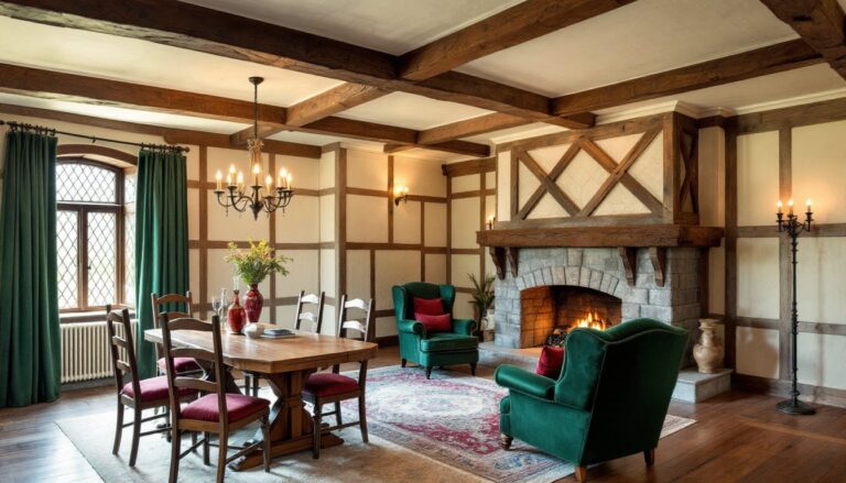
Brick and stone offer permanent, high-impact texture. Exposed brick works in lofts and industrial styles but can be expensive to install from scratch (consider brick veneer instead, thinner, lighter, easier to DIY). Natural stone tile (slate, travertine, marble) varies in finish: honed is matte and soft, tumbled is aged and rustic, polished is smooth and reflective. Each finish affects slip resistance and maintenance.
Tile provides endless texture options. Subway tile in a running bond is smooth: handmade zellige tile is irregular and glossy. Large-format porcelain slabs mimic stone or concrete with less weight and easier installation. For walls, consider 3D tiles or relief patterns, just keep grout joints tight (1/16″ to ⅛”) to avoid dirt buildup.
Wallcoverings like grasscloth, cork, or textured vinyl add dimension without construction. Designs on presentation boards often showcase these materials alongside fabric swatches to illustrate tactile layering. Grasscloth is natural and varies by panel (embrace the imperfection), but it stains easily and isn’t suitable for bathrooms. Cork is sound-absorbing and warm but requires sealing in moisture-prone areas.
Practical Tips for Layering Tactile Textures in Every Room
Layering texture is a balancing act. Too little and the room feels generic: too much and it’s sensory overload. Here’s how to approach it room by room.
Start with a base layer. In most rooms, that’s flooring and walls. Choose one dominant texture, say, wide-plank oak floors or a plaster accent wall, and let it set the tone. Everything else should complement, not compete.
Mix rough and smooth. Pair a sleek leather sofa with a chunky wool rug. Set a smooth marble lamp base on a rough-hewn wood console. Contrast keeps the eye moving and prevents monotony.
Vary the scale. Large textures (like a stone fireplace or oversized sectional) anchor the space. Smaller textures (like woven baskets or nubby pillows) fill gaps and add detail. Don’t rely on one scale alone.
Consider light. Matte textures absorb light and feel cozy. Polished or glossy textures reflect it and feel expansive. In a dark room, mix in reflective surfaces (glass, metal, lacquer) to bounce available light. In a bright room, matte finishes soften glare.
Account for maintenance. High-traffic areas need durable, easy-to-clean textures. Leather and tight-weave synthetics hold up better than linen or silk. Textured tiles hide grime better than polished stone. Be realistic about upkeep before committing to a high-maintenance material.
Test samples in situ. Fabrics and finishes look different under your actual lighting. Grab samples, tape them to the wall or drape them over furniture, and live with them for a few days. Natural light, incandescent bulbs, and LEDs all shift how texture reads.
Don’t forget vertical surfaces. Walls and ceilings are often overlooked. A coffered ceiling, board-and-batten wainscoting, or even a textured paint technique adds dimension without eating into floor space.
Layer seasonally. Swap lightweight cotton throws and linen pillows in summer for wool, velvet, and faux fur in winter. It’s an easy refresh that keeps the space feeling intentional.
Use architectural salvage. Reclaimed beams, vintage doors as headboards, or old barn wood as shelving bring texture with history. Just check for structural soundness and treat for pests if needed.
Finally, trust your gut. If a combination feels off, it probably is. Texture is as much about intuition as rules. Keep experimenting until the room feels like you.
Conclusion
Tactile texture isn’t a trend, it’s a fundamental design tool that separates forgettable spaces from memorable ones. Whether you’re refinishing a single wall or overhauling an entire floor plan, the materials you choose and how you layer them will define how a room feels, not just how it looks. Start small, mix intentionally, and let your hands, not just your eyes, guide the process.