Complementary colors sit opposite each other on the color wheel, red and green, blue and orange, yellow and purple, and they create the boldest visual contrast in <a href="https://pinelightdesigns.com/interior-design-trade-school/”>interior design. When used correctly, these pairings inject energy, depth, and balance into a space. But get the ratios wrong, and a room can feel like a circus tent. This guide walks through the fundamentals of complementary interior design, explains why these color schemes work so well, and shows how to apply them room by room without overwhelming your space.
Key Takeaways
- Complementary interior design uses colors opposite each other on the color wheel—such as blue and orange, red and green, or yellow and purple—to create vibrant visual contrast and boost energy in a space.
- The 60-30-10 rule prevents overwhelming a room: allocate 60% to a neutral or dominant color, 30% to the primary complementary hue, and 10% to the secondary accent shade.
- Muted or tinted versions of complementary colors (like sage green with burgundy, or blush pink with emerald) maintain contrast while avoiding visual fatigue and overwhelming intensity.
- Complementary interior design works best when one color dominates large surfaces like walls or furniture, while the other appears as accents in textiles, artwork, and accessories.
- Texture and finish quality diffuse color intensity—matte, velvet, and brushed finishes soften the impact compared to glossy surfaces, making bold complementary schemes more livable.
- Lighting temperature significantly affects complementary color perception: warm white LEDs (2700K–3000K) enhance warm tones like orange and red, while cool white (4000K+) brings out blues and greens.
What Is Complementary Interior Design?
Complementary interior design uses colors positioned directly across from each other on the color wheel to create dynamic contrast. The most common pairs are blue and orange, red and green, and yellow and purple. Unlike analogous schemes that use adjacent colors for harmony, complementary schemes rely on tension.
These pairings work because they contain no overlapping pigments. Blue is a cool primary: orange combines warm red and yellow. When placed side by side, each color makes the other appear more vivid, a phenomenon called simultaneous contrast. This optical effect is why a burnt orange throw pillow looks almost neon against a navy sofa.
In practice, complementary design doesn’t mean splitting a room 50/50 between two bold hues. It means choosing one dominant color (usually the cooler tone) for walls or large furniture, then using the complementary shade as an accent in textiles, artwork, trim, or accessories. The goal is controlled drama, not visual chaos.
Why Complementary Colors Create Visual Impact
Complementary schemes activate the eye. Because the colors contain opposing wavelengths, the brain processes them as vibrant and energizing. This makes complementary palettes ideal for spaces where someone wants to boost mood or focus, home offices, kitchens, gyms, and playrooms.
The contrast also adds perceived depth. A rust-colored accent wall in a blue bedroom makes the blue walls appear cooler and more recessive, giving the room dimension. This trick is especially useful in smaller spaces where flat, monochrome walls can feel cramped. Designers working on asymmetrical balance often pair complementary colors with offset furniture placement to amplify visual interest.
But the same intensity that creates drama can backfire. Pure, saturated complements (think fire-engine red and kelly green) can cause visual fatigue if used equally. The solution is to vary saturation and value, use a muted sage green with a deep burgundy, or a pale sky blue with a terracotta accent. Tints, tones, and shades of complementary hues maintain contrast without the headache.
Classic Complementary Color Pairings for Every Room
Blue and Orange Schemes
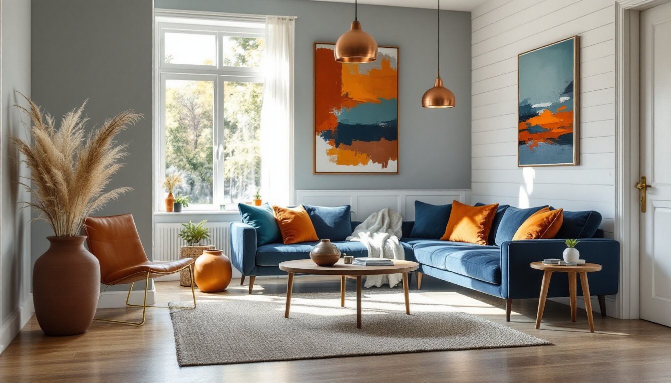
Blue and orange is the most popular complementary pair in residential design, and for good reason. Navy, slate, or powder blue walls provide a calm backdrop, while burnt orange, rust, or apricot accents add warmth without screaming for attention.
In a living room, consider painting three walls in Benjamin Moore Hale Navy (HC-154) and leaving one as a shiplap accent in natural pine with orange undertones. Add a cognac leather sofa, copper pendant lights, and a jute rug. The orange doesn’t need to be bold, wood tones, warm metals, and clay-based accessories all register as orange on the color wheel.
For a kitchen, subway tile backsplash in glossy white keeps things neutral, but swapping in terra cotta or burnt sienna grout introduces the complementary pop against blue-gray cabinetry. Open shelving with walnut or cherry brackets continues the warm accent. Contemporary pattern choices often layer blue-and-orange ikat or suzani textiles for additional visual texture.
Safety note: When painting cabinetry, always use a bonding primer like Zinsser B-I-N or KILZ Adhesion. Sand with 220-grit before topcoat application to prevent chipping.
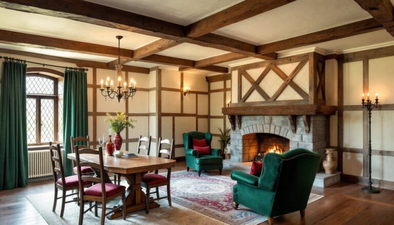
Red and Green Combinations
Red and green get a bad rap thanks to holiday overload, but outside December, this pairing is rich and sophisticated. The key is avoiding pure, saturated versions. Swap cherry red for brick, burgundy, or terracotta, and trade lime green for olive, sage, or forest.
A dining room with deep olive walls and burgundy velvet chairs feels moody and elegant, especially under warm LED bulbs (2700K). Add brass hardware and a walnut table to bridge the gap between the two tones. If painting walls, one gallon of quality paint (like Sherwin-Williams Emerald) covers approximately 350–400 square feet with proper surface prep.
In a bedroom, a soft sage duvet with rust or clay-colored throw pillows creates the same complementary contrast without the intensity. Linen or cotton blends in these tones feel more organic than synthetic fabrics. Experts discussing color psychology on design platforms emphasize that muted red-green schemes promote both energy and relaxation depending on lighting.
If the homeowner is painting over a bold existing color, two coats minimum are required. For dark-to-light transitions, tint the primer to match the topcoat halfway, it reduces the number of finish coats needed.
How to Balance Complementary Colors Without Overwhelming a Space
The 60-30-10 rule is the easiest framework for complementary schemes. Allocate 60% of the room to a neutral or dominant color (walls, large furniture), 30% to the primary complementary hue (upholstery, rugs, drapery), and 10% to the secondary complementary accent (pillows, artwork, hardware).
For example, in a blue-and-orange bedroom:
- 60%: Soft gray-blue walls (Behr Silver Drop or similar)
- 30%: Navy linen headboard, slate blue duvet
- 10%: Burnt orange throw pillows, copper table lamp, small ceramic vase
This ratio prevents either color from dominating. It also leaves breathing room for wood tones, metallics, and texture, elements that ground a space and keep it from feeling one-note.
Another trick is to use one complementary color in a saturated form and the other in a tint or tone. A deep emerald green sofa paired with blush pink (a tint of red) offers complementary contrast without the visual weight of two bold hues. Designers exploring proper proportion strategies often layer lighter complementary tints to create flow between rooms.
Texture also diffuses intensity. A glossy orange ceramic lamp reads louder than a matte terracotta planter, even if both are the same hue. Velvet, linen, brushed metal, and matte paint finishes all soften color impact. If a homeowner is worried about commitment, start with removable elements, pillows, throws, art, and test the scheme for a few weeks before repainting.
Applying Complementary Design to Different Rooms
Living rooms handle complementary schemes well because they have the square footage and variety of surfaces to balance bold contrast. Blue-gray sectional, rust-colored accent chairs, navy drapes, and a jute rug with burnt orange binding create layered interest. Avoid matching sets, mix textures and shades within the same complementary family.
Kitchens benefit from subtle complementary accents. If cabinetry is blue or blue-gray, warm wood countertops (butcher block, walnut) or a terra cotta tile backsplash introduce orange undertones. Copper or brass cabinet pulls add another layer. Avoid painting upper and lower cabinets in both complementary colors, it fragments the space. Stick to one dominant hue and let materials (wood, metal, stone) bring in the complement.
Bedrooms need restraint. Complementary schemes are energizing, which isn’t ideal for sleep. Use the complementary pair in lower saturation: dusty blue walls with rust-colored bedding, or soft sage with blush accents. Keep ceilings and trim white or off-white to maintain calm. Blackout curtains in the dominant color help, and a dimmer switch (standard 600W rotary or digital dimmer, $15–$40) is worth installing for mood control.
Bathrooms are a good testing ground for bolder complementary contrast because they’re small, contained spaces. Navy subway tile with copper fixtures and a burnt orange bath mat creates a jewel-box effect. Use mildew-resistant paint (Behr Premium Plus or Zinsser Perma-White) in high-humidity areas. Ventilation is critical, make sure the exhaust fan is rated for the room size (typically 50–80 CFM for a standard 5’×8′ bath). Many renovation guides on leading design sites recommend pairing complementary tile with white grout to soften the overall impact.
Home offices thrive on complementary contrast, it promotes focus without monotony. A desk against a deep teal accent wall, paired with a rust-colored task chair and warm wood shelving, balances cool and warm. Add a corkboard or pegboard painted in the accent color for function and style. If drilling into drywall for shelving, locate studs with a stud finder (magnetic or electronic, $10–$30) and use appropriate anchors, toggle bolts for hollow walls, wood screws into studs.
For all rooms, lighting temperature matters. Warm white LEDs (2700K–3000K) enhance orange, red, and yellow tones: cool white (4000K+) brings out blues and greens. Layered lighting, overhead, task, and accent, lets the homeowner adjust the color balance throughout the day.