Monochromatic design isn’t about painting everything one flat color and calling it done. It’s a nuanced approach that uses varying shades, tones, and tints of a single hue to create cohesive, sophisticated spaces. When executed well, a monochromatic room feels intentional and layered, not boring or one-dimensional. This guide walks through the fundamentals of working within a single-color palette, from choosing the right base color to adding visual depth through texture, light, and strategic material choices. Whether you’re planning a full room refresh or just curious about this design approach, you’ll learn practical techniques to pull off monochromatic schemes that actually work.
Key Takeaways
- Monochromatic interior design uses varying shades, tints, and tones of a single hue to create cohesive, sophisticated spaces that feel intentional and layered rather than flat.
- Texture and materials are essential in monochromatic design—mix smooth and rough, matte and glossy surfaces to create visual depth when color variation is limited.
- Strategic lighting, including ambient, task, and accent options, becomes even more critical in monochromatic interiors to define zones and highlight architectural features.
- Small or awkwardly shaped rooms feel more spacious in monochromatic schemes because walls, trim, and furnishings share a color family, creating a continuous visual plane.
- Start with a neutral base color like greige, soft gray, or warm white if you’re new to monochromatic design, then test paint samples at different times of day and under various lighting conditions.
- Each room benefits from different color intensities—bedrooms work best with calming hues like soft blue or muted green, while kitchens and home offices can handle more saturated, energizing tones.
What Is Monochromatic Interior Design?
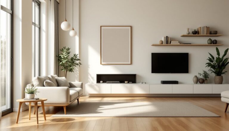
Monochromatic interior design uses variations of a single color throughout a space. This doesn’t mean everything is the exact same shade, that would feel flat and institutional. Instead, the approach relies on mixing tints (lighter versions created by adding white), shades (darker versions created by adding black), and tones (muted versions created by adding gray) of one base hue.
For example, a monochromatic blue room might include navy wainscoting, slate blue walls, powder blue textiles, and cream-white trim with blue undertones. All derive from the same color family, but the variation in saturation and lightness creates visual rhythm.
This differs from asymmetrical balance techniques that rely on contrast, or analogous color schemes that pull from adjacent hues on the color wheel. Monochromatic design keeps things simple on the color front while demanding more attention to other design elements like texture, pattern, and proportion.
The appeal lies in its inherent cohesion. Without competing colors, the eye moves smoothly through the space, making rooms feel larger and more harmonious. It’s particularly effective in smaller spaces where too many colors can feel chaotic.
Why Choose a Monochromatic Color Scheme for Your Home
A single-color palette offers practical advantages beyond aesthetics. First, it simplifies decision-making. Once you’ve committed to a base color, every material choice, paint, fabric, tile, cabinetry, gets filtered through that lens. You’re not debating whether blue and green work together: you’re deciding between seafoam and sage within the green family.
Monochromatic schemes also make small or awkwardly shaped rooms feel more spacious. When walls, trim, and furnishings share a color family, boundaries blur, and the space reads as one continuous plane rather than a collection of separate surfaces. This technique is especially useful in bathrooms, hallways, and compact bedrooms.
From a resale perspective, monochromatic interiors photograph well and appeal to a broad range of buyers. They feel designed without being polarizing. Neutrals like greige, warm white, or soft gray dominate contemporary design trends for this reason, they provide a clean canvas that doesn’t require immediate repainting.
Finally, monochromatic design can highlight architectural features. Without color contrast to distract the eye, details like crown molding, coffered ceilings, or built-in cabinetry become more prominent. The space itself becomes the focal point.
How to Select the Perfect Base Color for Your Monochromatic Palette
Start by assessing the room’s natural light. North-facing rooms receive cool, indirect light, which can make cool colors like blue or gray feel drab. Warmer hues, cream, blush, or terracotta, counteract that chill. South-facing rooms get intense, warm light throughout the day, so cooler tones like sage or slate help balance the brightness.
Consider the room’s function next. Bedrooms benefit from calming, low-energy colors: soft blues, muted greens, warm grays. Active spaces like kitchens or home offices can handle more saturated or energizing hues, chartreuse, burnt orange, deep navy.
Test paint samples on all four walls and observe them at different times of day. A color that looks perfect at noon might read completely different under evening incandescent lighting. Purchase sample quarts and paint 2′ × 2′ sections rather than relying on tiny paint chips.
Don’t ignore existing fixed elements. If you have oak flooring with warm orange undertones, a cool gray monochromatic scheme may clash. Work with what you’ve got, or budget for replacing it. Similarly, if you’re keeping existing cabinetry, tile, or countertops, your color choice needs to complement those materials.
Neutrals (white, gray, beige, black) are the safest bets for first-timers. They’re forgiving, versatile, and easier to layer than saturated hues. Once you’re comfortable with the concept, branch into bolder territories like monochromatic designs featuring jewel tones or earthy palettes.
Essential Techniques for Adding Depth and Visual Interest
Layering Textures and Materials
Texture is what prevents monochromatic rooms from feeling flat. When color variation is minimal, tactile contrast becomes critical. Mix smooth and rough, matte and glossy, soft and hard.
In a white-on-white living room, pair a linen sofa (matte, nubby) with a lacquered coffee table (glossy, smooth), a jute rug (coarse, natural), and velvet throw pillows (plush, light-catching). Each material reflects light differently, creating subtle visual breaks even though everything reads as white.
Wall treatments also add texture without introducing new colors. Consider tongue-and-groove paneling, shiplap, Venetian plaster, or textured wallpaper in the same hue as your walls. These create shadow lines and depth that flat drywall can’t achieve.
Don’t overlook flooring and window treatments. In a gray bedroom, charcoal wool carpeting feels different underfoot than polished concrete or gray-washed oak planks, even if the color is similar. Linen drapes diffuse light softly: cellular shades provide clean lines: bamboo blinds add organic texture.
Implementing thoughtful pattern choices within your monochrome palette, like tone-on-tone geometric wallpaper or subtle damask upholstery, can further enhance depth without breaking the color scheme.
Playing with Light and Shadow
Lighting is the second major tool for creating dimension in monochromatic spaces. Layered lighting, ambient, task, and accent, becomes even more important when you can’t rely on color to define zones.
Ambient lighting establishes overall brightness. In monochromatic rooms, avoid harsh overhead fixtures that flatten everything. Instead, use recessed cans on dimmers, flush-mount fixtures with frosted diffusers, or indirect cove lighting that bounces off ceilings.
Task lighting focuses on functional areas: pendant lights over kitchen islands, swing-arm sconces beside beds, or under-cabinet LED strips in pantries. In a monochromatic kitchen, for instance, consistent cabinetry color makes task lighting essential for safety and usability.
Accent lighting highlights architectural features or decor. Picture lights on artwork, uplights in corners to graze textured walls, or LED strips behind floating shelves all add drama. In a monochromatic scheme, these create visual focal points that color contrast would normally provide.
Natural light matters too. If your room lacks windows, monochromatic design can amplify that cave-like feel. Lighter tints help, but don’t expect miracles. Windowless spaces benefit from warmer color temperatures (2700K-3000K) in light bulbs to counteract any institutional vibe.
Room-by-Room Tips for Monochromatic Design Success
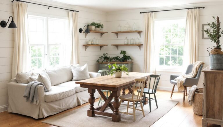
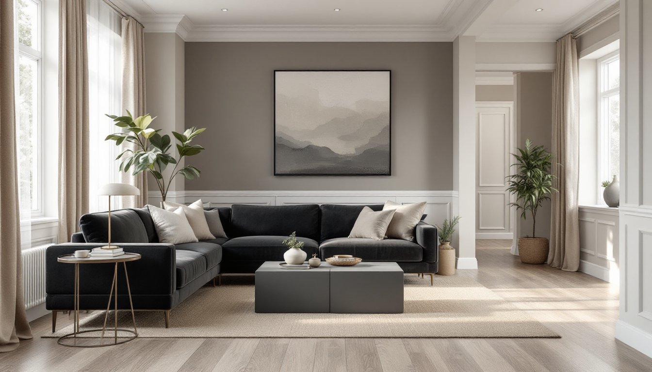
Living Rooms: Start with a neutral base (greige, taupe, soft white) if you’re hesitant. Layer in deeper tones through furniture, a charcoal sofa against taupe walls, for example, and lighten up with cream pillows and throws. Introduce wood tones sparingly: even “neutral” oak or walnut introduces warm undertones that can clash with cool grays. If going bold (like all-navy or emerald), ensure adequate lighting and balance dark walls with lighter flooring or rugs to prevent the space from feeling oppressive.
Kitchens: Monochromatic kitchens often use white or gray because they hide less dirt than darker hues and feel clean. Matte-finish cabinetry pairs well with glossy subway tile backsplashes and polished quartz countertops to create textural contrast. Stainless steel appliances read as neutral gray: if going for an all-white kitchen, consider white panel-ready appliances for full integration. Open shelving in the same color as walls creates continuity, but be mindful, monochromatic kitchens show clutter more noticeably.
Bedrooms: Soft, restful hues work best: blush, sage, sky blue, warm gray. Layer bedding in varying shades, if walls are pale blue, use navy duvet covers, chambray sheets, and cream blankets. Incorporating proportion principles ensures that furniture scale doesn’t overwhelm the monochromatic palette. Blackout cellular shades in the same color family help with sleep while maintaining the scheme. Bedside table lamps with linen shades add warmth without introducing competing colors.
Bathrooms: Tile is the main opportunity for texture here. Hexagonal matte floor tiles, glossy 3″ × 6″ subway wall tiles, and a honed marble vanity top, all in shades of white or gray, create visual interest. If you’re keeping a fiberglass tub/shower surround (often almond or white), choose wall paint that complements rather than fights it: replacing a tub is expensive and messy. Brushed nickel or matte black fixtures add subtle metallic contrast without breaking the monochrome rule.
Entryways and Hallways: These transitional spaces benefit from monochromatic treatment because it makes them feel like part of the larger home rather than disconnected corridors. Use the same wall color as adjacent rooms, but consider a darker shade on wainscoting or a textured wallpaper on one accent wall to add personality. Runner rugs in tonal stripes or subtle patterns keep floors from showing dirt while maintaining cohesion. Good lighting is critical in hallways, wall sconces every 8-10 feet prevent dark, tunnel-like feels.
For more design inspiration, consider how professional spaces balance monochromatic schemes with functional needs specific to each room. Platforms like homify showcase real-world examples across various color palettes and room types, offering practical ideas you can adapt to your own home.